Mid-Century Remodel in Oregon Home Magazine
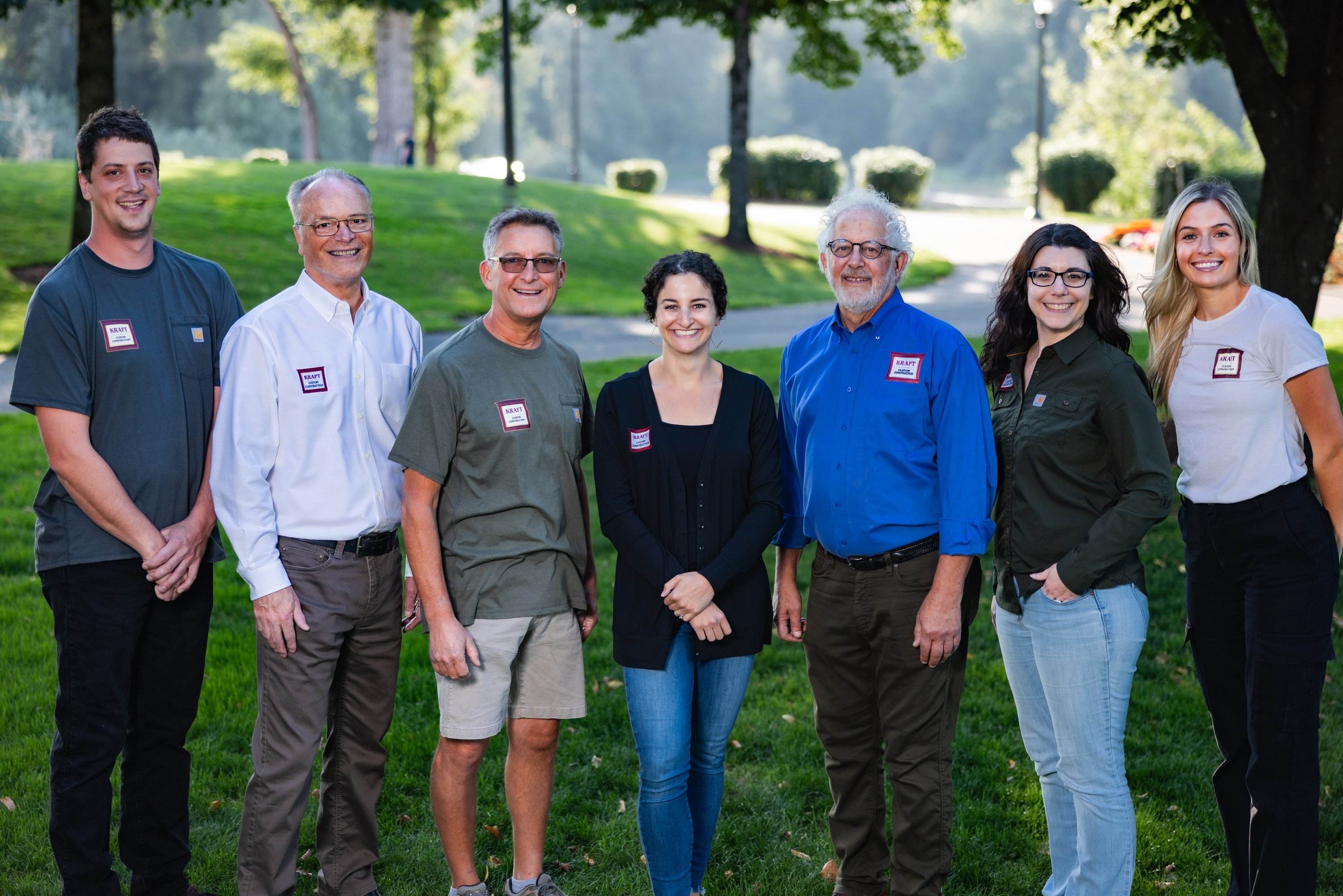
Fortunately, (Angus) Vail knew where to turn for remodeling help, thanks to an earlier makeover that included turning his formerly snug main bathroom into what Vail now proudly dubs his Bathing Cave. The enlarged space features an ample new soaking tub, multiple shower heads and glimmering red tile made of recycled glass. Vail was thrilled with the outcome and reconstituted much the same group for this latest (Mid-Century remodel) effort. They included Portland architect and friend, Tim Mitchell; contractor Robert Kraft, the principal of the design-build firm Kraft Custom Construction; and interior designer Petra Geiling of Petra Geiling Interior Design in Salem.
Mitchell played an advisory role this time around. At his suggestion, Vail enlisted Jason Swift, the principal of SWIFT Architecture LLC in Portland, as project architect, with Kraft, Geiling, and landscape architect Laura Canfield, the principal of Laura Canfield Garden Design, also serving as key members of Vail’s remodeling team. “And you’ve always got to thank the client, because if the client doesn’t have vision and doesn’t want to invest in creating the space and step out a little bit, you don’t get to do jobs like this,” says Kraft. “It all goes back to this team approach. Angus (Vail) has the vision, Petra helps him put that vision into particular finishes, Jason helps him put it into the architectural plans and engineering, we all help bring the ideas to life, and Laura makes a serene outside and creates that indoor-outdoor connection – that’s how we achieve what we set out to do.”
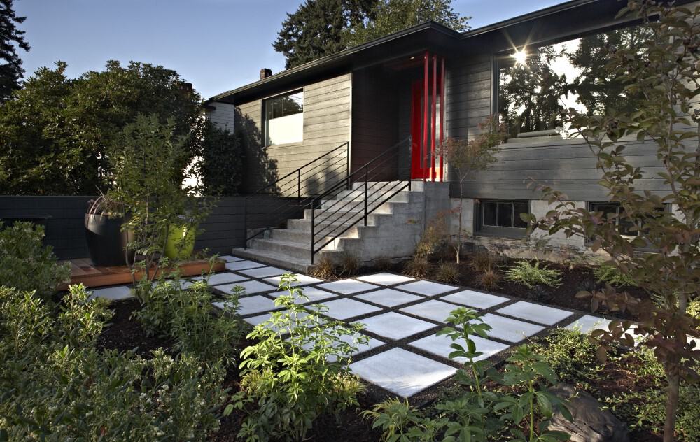
Vail loved their ideas for this Mid-Century remodel project. “I hired good people to do their thing, and I got out of the way,” he says. “They were smart in figuring out what I needed. The original scope of my imagination was very limited compared to what I ended up getting.”
Construction began in May 2010 and ended four months later without a hitch. During that period, with Vail decamped to a nearby rental house, Kraft and his crew bumped out the back of his home 10 feet to create an expansive new dining area. In place of a typical exterior wall, they installed floor-to-ceiling sliding glass doors that bathe the interiors in natural light and let Vail and his dinner guests enjoy the beauty of his revamped backyard. Knotty-cedar siding on the walls near the sliding doors servers as a visual transition between indoors and out.
With Vail’s dining room shifted to the new bump-out, the kitchen could then expand into the space the dining room previously occupied. No longer boxed in by internal walls and ill-conceived cabinetry, the unencumbered kitchen enjoys sightlines that extend from the backyard to the front. “The design was basically to open it up,” says Swift, who kept the kitchen free of upper cabinetry that would’ve impinged on the room’s newfound spaciousness. “We put the deep storage along the wall next to the refrigerator, which kept us from needing upper cabinetry.” He also put in a larger window above the sink to balance out the incoming light from both the picture window in the living room and the sliding doors next to the dining area.
Vail opted for butcher-block surface on the island and laminate finishes for his countertops and cabinetry. Besides being less expensive than granite, the clean, crisp laminate meshed with his home’s mid-century pedigree. He also embraced Geiling’s suggestion of a scrumptious palette that includes Carmen Red kitchen cabinetry and black-raspberry walls in the living room.
READ MORE ABOUT THIS PROJECT HERE →
“I told Angus, ’It’ll look like the kitchen area in a New York loft – modern, sleek,’” says Geiling. “Part of the red-cabinet scheme came of my knowing that Angus loves red, plus I like that it refers back to the red bathroom. The bathroom was done a few years before, but I wanted continuity and flow throughout the house.”
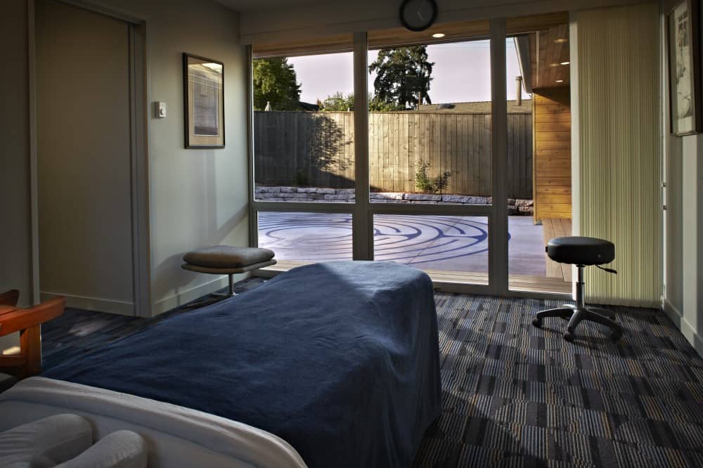
To keep the massage studio from encroaching on Vail’s private quarters, Swift designed it as a multi-room wing attached to the back of the house. Its massage room, which adjoins a bathroom and shower, features a state-of-the-art massage table. Behind a door is a walk-in closet for work-related supplies. Awash in natural light and perfectly positioned to enjoy a stellar view of the labyrinth, the massage room is outfitted with an abundance of climate-control features to ensure that clients stay comfortable during a massage.
Not long after the studio’s completion, Kraft arranged to have a massage in the studio that his own firm built – and experienced his creation firsthand. “It’s a very pleasant and soothing space,” he says. “But what I’m proudest of is that it solved a problem. Angus couldn’t fulfill the next step in his life dream without this space.”
The last task of this Mid-Century remodel project took place when Robert Ferré of Labyrinth Enterprises in St. Louis, Mo., flew in to lay out the circuitous pattern onto the new concrete slab in the backyard – a project completed on Vail’s birthday. “Finishing it then was a nice cap that gives the whole project a sense of destiny,” says Vail.
This Mid-Century remodel project was featured in Oregon Home Magazine.


